Friday, 5 May 2017
Media Evaluation Question 2
How does the Media Product represent a particular social group?
At the start of the research process I began to look at magazines that would help me with the design of my magazine. I wanted to appeal to a acoustic audience aged from 16-25, therefore I had to show this throughout my music magazine.
The social group that I have decided to represent throughout my magazine are young adults who share a passion for the acoustic genre of music. They will be from the middle-lower class and will be aged between 16-25. My magazine focuses not only on new and upcoming artists but the way the current generation inspired those artists to chase their dreams and find out what drove them. My demographic is 65% male and 35% female. I have portrayed this social group through the clothes worn in my images and also the font used. I ensured that the font had a clean look to it so that it represents the clean sound of acoustic music, even though the title font for my double page spread looks slightly distorted it still has a clean look to it. My choice of featured artist also fits the target audience as he is within the target age of 16-25 and wears trending clothes that show that he isn't someone who's into raving music but is more into original chill styled music. My artist looks slightly rough through the serious expression on his face to show the hard times he had to go through before he finally reached his dreams.
When researching into the type of magazine that I wanted to create there was only really one prime example that I could gain inspiration from and that was the "Acoustic" magazine as not only did it discuss the same genre of music but a lot of the artists involved are very popular acoustic artists that are well-known. I also really liked the layout of it because it had a clean look to it so I tried to replicate that clean look with my magazine to help show what the magazine was about. Throughout my pages I have applied them to technophiles with the link to the website in the footer and also the social media advertisements on the contents page. I feel my article also helps to represent the target audience of my magazine well as it shows the struggle he went through having to busk on the streets for any sort of income possible and how long it took for him to get discovered.
As seen below I've tried my best to make my front cover look similar to that of the front cover for an edition of 'Q' magazine featuring Ed Sheeran as he is a popular artist and 'Q' is the biggest selling magazine in the UK. I also feel like Ed Sheeran is an artist who appeals to the same target audience of my magazine so I used that front cover as my main example.
As you can see my front cover does have some similarities but there are some differences such as my extensive use of logos which I wish I didn't do now as I feel I could've added more sell lines instead of sticking a massive play button at the top left corner of my front cover, but I do feel as though the sell lines included and the advertisements do target my demographic audience.


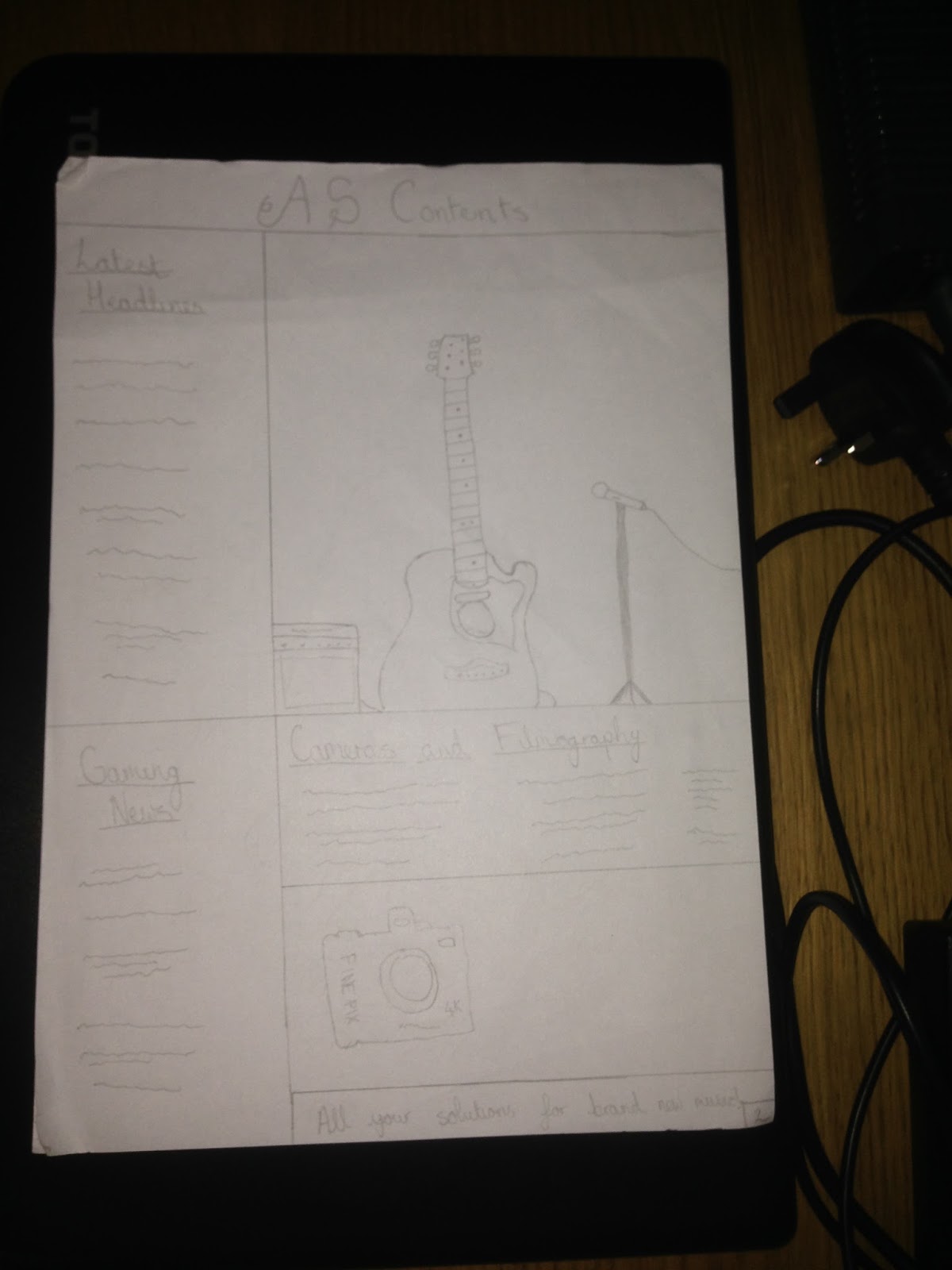
For my contents page I feel as though there was a lot I could've done to improve it as I feel like it was the page that was rushed the most. But I do feel with what I've done using Social Media as references and referencing the website at the bottom are still a way to appeal to my target audience of 16-25 years old.

I feel that the information I included in the article would appeal to any acoustic music fan as it shows the fact that even when things were going slowly and he wasn't seeing much hope through busking he still carried it out and did eventually end up being discovered and finally catching his dream after "chasing" them for so long.


Saturday, 21 January 2017
Music Magazine Draft


Monday, 2 January 2017

I used the same font for my masthead on the contents but I changed the colour of the font and the font itself for the "Contents" part as I felt it makes it so that the masthead stands out from the actual contents page itself. I also felt by using the colour yellow for the "Contents" part it helped it to be more similar to the page itself and linked it a lot more with the contents page.
Subscribe to:
Posts (Atom)